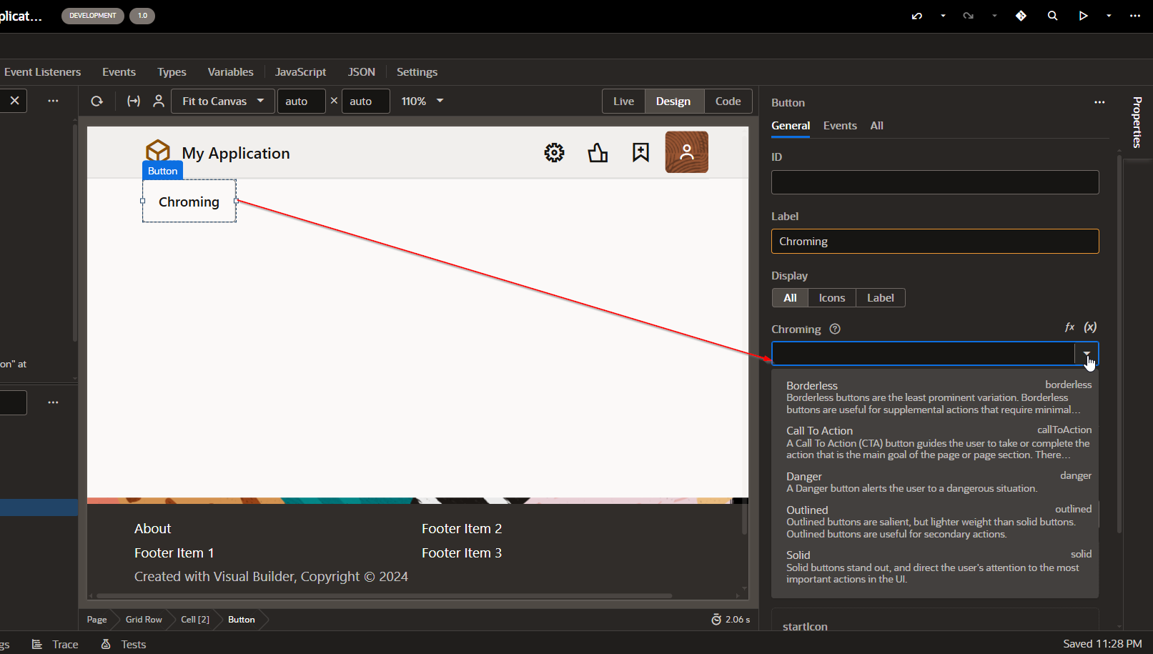
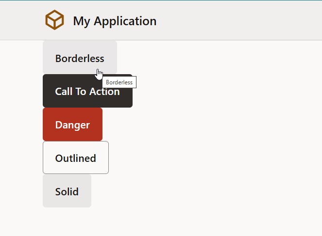
In Oracle Visual Builder Cloud Service (VBCS), the “Chroming” property for a Button controls the visual style or appearance of the button — essentially how it looks in terms of emphasis and display priority.

Common Chroming Options in VBCS Buttons:
(A) Borderless:
Button without border or background — minimal styling. Low emphasis.
(B) Call To Action:
Visually highlighted button meant to draw attention (used for primary actions).
(C) Danger:
Indicates a destructive or risky action (like Delete).
(D) Outlined:
Button with only an outline (no background fill). Medium emphasis.
(E) Solid:
Default filled button with background color. Strong visual emphasis.

